Quick Overview
- Visitors piece your website into one story as they click through it, whether you’ve planned that story or not.
- A specific detail can persuade more than a bigger statistic, even when the statistic is the stronger evidence.
- The StoryBrand framework works for a reason most explanations of it skip over.
- A story with a little rough edge left in can be more convincing than one that sounds rehearsed.
- Trust can quietly slip in the gap between what your homepage promises and what a service page delivers.
How Visitors Piece Your Website Into One Story
Picture two witnesses describing the same incident. One account is clear and connected: this happened, which led to this, which is why that happened next. The other gives the same facts, but scattered, with nothing joining them up. Ask a jury which one they believe, and it’s rarely the one with more facts. It’s the one that adds up.
A visitor reading your website is doing something similar. Your homepage makes a claim, your About page explains who’s behind it, your service pages describe what you do, and your case studies show it working. Nobody reads these as five separate documents. They read them in order and quietly work out whether they add up to one consistent business. When they do, the whole site feels more trustworthy than any one page on its own. When they don’t, that gap shows up as a nagging doubt, a case study that reads like it came from a different business, or a service page that quietly backs away from what the homepage just promised.
Why One Small Detail Can Override the Bigger Picture
This tendency is called narrative bias: a story that adds up feels truer than facts that don’t, even when the facts are the stronger evidence.
Researchers once asked over a thousand people a simple question: is a New York Times reader more likely to hold a Ph.D., or to have a high school diploma and no college education? Statistically it isn’t close: people whose education stopped at high school massively outnumber Ph.D. holders in the general population. But when the question added one detail, that this person reads an “intellectual” newspaper, 41% of people picked the Ph.D. anyway. That single detail was enough to build a more convincing story in their head, an intellectual habit implies an intellectual person, and that story won out over the actual odds.
For a website, this means visitors aren’t neutrally collecting facts about your business as they browse it. They’re building a working story about who you are from whatever details you give them, a headline, a photo, a specific number, a turn of phrase, and that story then shapes how they read everything that follows.
How the StoryBrand Framework Turns This Instinct Into a Formula
If you’ve come across the StoryBrand framework, this is the same instinct already turned into a formula. Donald Miller’s version puts the customer at the centre of the story: they want something, they hit a problem, they meet a guide (that’s the business), the guide hands them a plan, and the story ends with them succeeding, having avoided whatever would have happened if they hadn’t acted. The unresolved question sitting in the middle of that structure, will this work out for me, is the same pull behind the Curiosity Gap: a visitor keeps reading because the story hasn’t resolved yet.
Most advice on StoryBrand stops at “here’s the structure, use it.” What it usually skips is why the structure works. Without it, a visitor looking at a headline, a features list and a testimonial has to work out for themselves how those pieces are supposed to relate, do they support each other, or just sit next to each other by coincidence? StoryBrand answers that question in advance, by giving every piece of content a fixed role in one story: this is the problem, this is the guide, this is the plan. It isn’t persuasive because it’s a nicer way to write copy. It’s persuasive because it removes the guesswork the brain was already doing anyway.
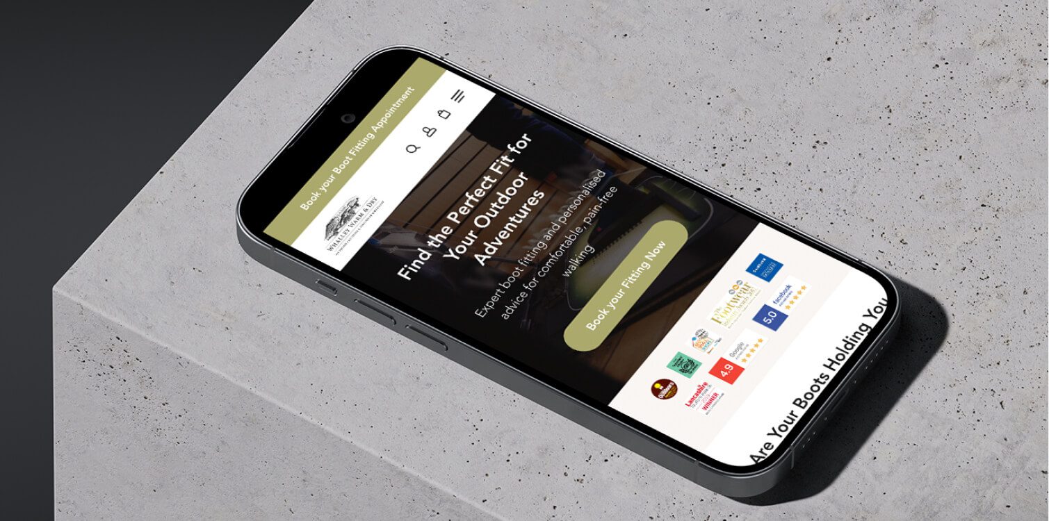
You don’t need to hit every beat of the seven-part structure exactly. What matters is the outcome, and it’s the same outcome good web design should be aiming for regardless of framework: a visitor should be able to leave your homepage knowing who it’s for, what problem it solves, and what happens if they act, without piecing that together themselves. The Whalley Outdoor case study, for an outdoor retailer near Accrington, shows the structure in place on a live ecommerce site: a specific problem and a clear plan, rather than a plain list of features.

The StoryBrand seven-part framework, based on Donald Miller's Building a StoryBrand.
Why a Specific Detail Beats a Credentials List on Your About Page
This works just as well on the About page, which most businesses treat as an afterthought.
A credentials list, years trading, number of clients, sectors served, is technically the stronger evidence. It’s accurate and it’s honest. But on its own, it often persuades less than one specific, slightly unusual detail about why the business exists, because a specific detail is exactly the kind of thing a visitor’s brain uses to build the story it’s already looking for. Patagonia’s own company history is a well-known example: rather than opening with mission-statement language, it explains that founder Yvon Chouinard’s steel climbing pitons became the company’s best-selling product, until he realised they were scarring the rock faces climbers loved and deliberately undercut his own bestseller by promoting removable aluminium chocks instead. That single, specific turn does more to build trust than a paragraph about “passion” or “quality” ever could, precisely because it’s too specific, and too against the company’s own short-term interest, to have been invented for marketing.

Screenshot: Patagonia's company history page, patagonia.com/company-history
It can also work against a business, and it’s worth watching for. A recent National Geographic travel feature was paid content, labelled as sponsored by a Saudi tourism authority with no editorial input from National Geographic, built around historic sites and craftsmanship in the AlUla region. It’s a well-researched piece, but three of its four images were credited simply “Photograph from Adobe Stock”, generic stock captions rather than photos of the actual places or objects the article was describing. The issue isn’t the subject matter, it’s that a piece built to feel specific and grounded in a real place loses some of that credibility the moment its supporting images turn out to be generic and interchangeable. The same thing happens on a business website when a service page uses a generic stock photo of a laptop and a coffee cup instead of a real photo of the actual product, premises, or team behind it: the words promise something specific, but the images quietly tell a more generic story underneath them.
A founder story with the rough edges deliberately smoothed away runs into the same problem. Narrative bias makes people trust a coherent story, but it doesn’t stop them noticing when a story sounds rehearsed rather than real.

Screenshot: National Geographic's paid content feature on AlUla: three of its four images credited simply "Photograph from Adobe Stock."
When a Well-Written Case Study Still Feels Out of Place
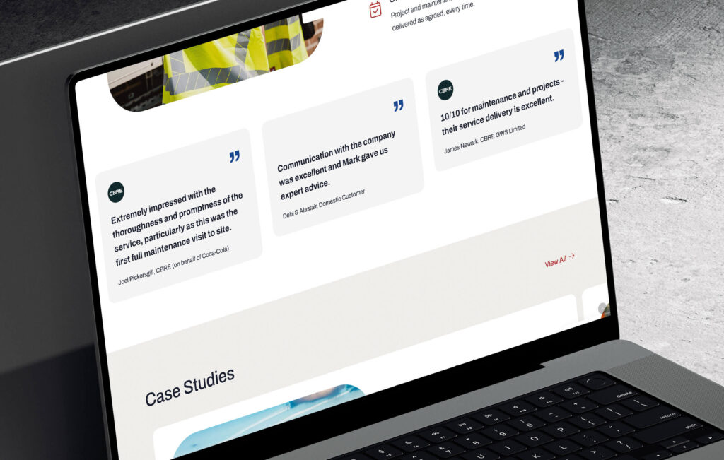
A case study can be accurate and well written and still undermine the page around it, if its tone doesn’t match the story that page is telling.
A funeral services website is a clear example of why this matters. That kind of business earns trust by feeling calm and unhurried throughout, it’s what allows someone dealing with a difficult moment to feel comfortable making contact rather than rushed into it. If the case study on that same site suddenly switched into hard-sell marketing language, something like “see how we doubled enquiries overnight,” it would read as though it had wandered in from a completely different kind of business, regardless of how well each sentence was written. The mismatch itself is what costs trust, not the quality of the writing. The Variety Funerals case study is a useful reference point for getting this balance right, gentle, specific, and consistent with everything around it.
The practical check is simple: read a case study back in the context of the page it belongs to, not just on its own merits, and ask whether it sounds like the next part of the same story, or a chapter that’s wandered in from somewhere else.
Go Deeper
Conversion-Focused Web Design: A Framework for Turning Traffic into Enquiries
Why a Service Page Can Undo What the Homepage Promised
The biggest version of this problem sits between a homepage and the service pages it links to. A homepage headline works like the opening line of the story, it sets up a problem and hints at how it gets resolved. Everything a visitor clicks through to next gets read as the next chapter of that same account, not as a fresh start.
Say a homepage promises something like fast, straightforward turnaround, no complicated process, a clear path from enquiry to result. If the service page behind that promise opens with several paragraphs of process detail before it gets anywhere near delivering on it, visitors don’t consciously think “these two pages disagree with each other.” They just feel a small, hard-to-place drop in confidence. The service page usually isn’t wrong, it’s simply answering a question the visitor hadn’t asked yet, while leaving the one the homepage raised unanswered. That’s exactly the kind of gap a conversion review is built to catch.
The Curse of Knowledge often drives this: once you know your own process inside out, it’s tempting to lead with how it works rather than what it delivers, which is how a homepage’s simple promise turns into a service page full of process detail. The jargon and the broken promise tend to arrive together, for the same underlying reason.
A Simple Way to Check If Your Website Tells One Consistent Story
You don’t need to rewrite your website to find out where this applies. You need to read it the way a first-time visitor actually does, in one sitting and in order, rather than the way you experience it, one familiar page at a time. It’s a lighter version of the same exercise behind a proper UI/UX review, just done on your own, in an afternoon.
A few honest questions worth sitting with:
- Read straight through, would your homepage, About page and a service page leave a visitor with one idea of what you do, or several slightly different ones?
- Does the detail on your About page feel specific and real, or could it belong to any business in your industry?
- Would your case studies sound like they came from the same business as the rest of the page around them?
- Does every page’s next step point the same way, or does each page invent its own?
This tends to matter more the more a visitor has to trust you before they act, a considered purchase, a service business, anything where the decision to enquire depends on feeling confident rather than just finding a price. A simple site selling one product at a fixed price has less riding on this than a website asking someone to hand over their details before they’ve even spoken to you.
Either way, most websites will find at least one place where the story doesn’t quite add up. Worth remembering too that the ending carries its own weight, it’s the last thing that shapes how the whole account gets remembered, which is what the Peak-End Rule is about. Better to find the gap by reading your own site closely than to have a visitor find it by leaving.
Not sure if your website reads as one story?
A short review can usually show you exactly where the thread breaks.