
Quick Overview
- People tend to remember things they haven’t finished better than things they have, and that pull can bring visitors back to your site days after they’ve left it.
- A form that still shows what someone typed when they come back turns an abandoned enquiry into something worth finishing, rather than something to start over.
- Push it too hard (chasing emails, a pop-up nagging them to finish) and the same pull that brings people back starts pushing them away instead.
Why They Came Back Days Later
Someone starts filling in your enquiry form, gets pulled away partway through, and closes the tab. Days later, they’re back anyway, picking up roughly where they left off, without a discount code or a retargeting ad in sight.
That’s not urgency doing the work. It’s closer to why a waiter can recall an unpaid table’s order, then forget it the moment the bill is settled. The psychologist Bluma Zeigarnik documented this in the 1920s: people tend to remember unfinished tasks better than finished ones. That’s what sits behind the Zeigarnik effect in web design: an open loop tends to nag at attention until it’s closed, and a website can be built to leave one open on purpose.
Why Most Advice On The Zeigarnik Effect In Web Design Only Covers Half The Story
Search for the Zeigarnik effect and web design together, and the same three examples come up repeatedly: progress bars, multi-step forms, and Netflix cueing up the next episode before you’ve decided to watch it. These aren’t wrong, but they’re mostly describing a different principle. That’s the Goal Gradient Effect at work: motivation rises as the distance to a goal shrinks, and it operates within a single visit. Show someone they’re most of the way through a form, and they tend to push on and finish it there and then.
Zeigarnik is a slower, less visible effect. It doesn’t need a visible finish line, and it doesn’t need to happen in one sitting. An incomplete task tends to lodge in memory simply because it’s incomplete, and it can pull someone back hours or days after they’ve left your site.
It’s also worth separating this from the curiosity gap, the idea that withheld information pulls a reader onward through a piece of content. The curiosity gap is about something a visitor doesn’t know yet. Zeigarnik is about something they’ve already started doing.
That slower pull, the one that works on someone after they’ve left rather than during the visit itself, is what’s worth designing for on a web design project built around enquiries, one piece of the wider approach to turning traffic into enquiries.
How An Unfinished Enquiry Pulls Visitors Back To Your Site
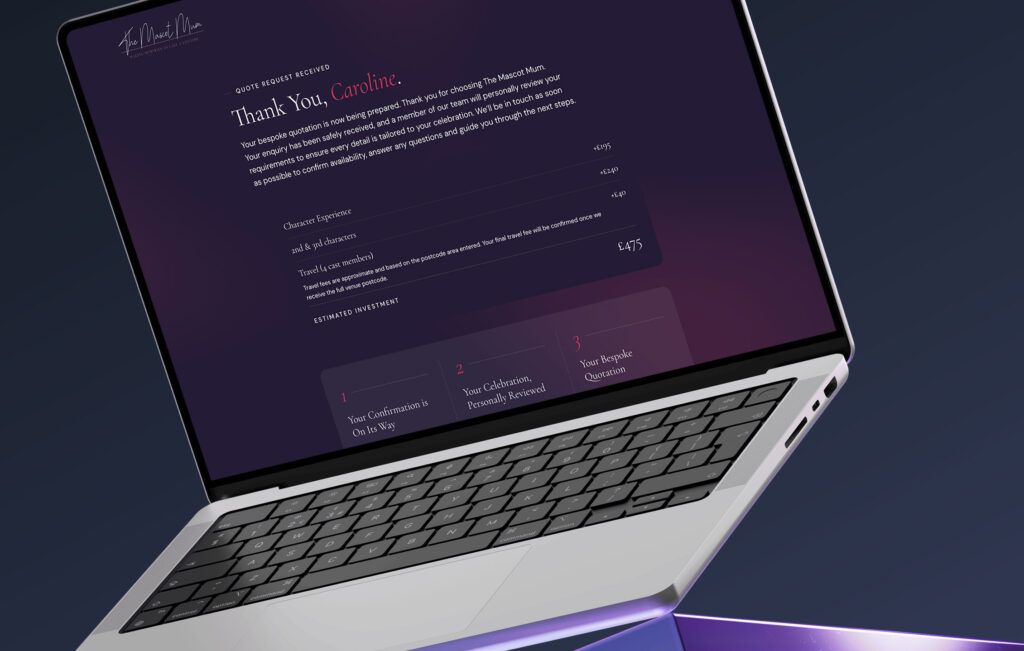
It shows up most clearly in the enquiry form itself. Picture a quote form abandoned halfway through. If it resets to blank on return, the visitor has to decide whether it’s worth starting again. If it still shows the two fields they already filled in, finishing feels like a five-minute job rather than a fresh start.
Deciding what’s worth saving, and which step matters enough to remember, is a conversion rate optimisation question. Making it actually persist, surviving a closed tab rather than just a page refresh, is a web development one.
The wording on the resume prompt matters less than the fact that it’s there. “Continue your enquiry” and “Pick up where you left off” will tend to do roughly the same job, provided the form actually remembers what the visitor typed.
Designing An Ongoing Story Instead Of A One-Time Visit
The most durable version of this effect skips the form. Rather than leaving one task open, it frames an entire section, or an entire site, as still in progress, so a visitor returns not to finish something but to see what’s changed.
Accrington Town Square, a site for a multi-year town centre regeneration project, is built this way. Since the transformation spans years, the site runs on a news hub and a running Town Centre Projects section rather than a static “about the scheme” page, giving residents in Accrington a reason to check back on something left open by design.
The same idea works at a smaller scale. A “what we’re building next” page or a visible list of work in progress can do a similar job for a smaller business, as long as there’s something real behind it to update.
Where Open Loops Tip Into Frustration
Most of this stops working the moment it’s forced. An open loop tends to work because it feels like something the visitor chose to leave unfinished, not something a website is holding onto. Stack a saved-basket banner on top of a countdown timer on top of a pop-up, and the same pull that quietly brings someone back starts to feel like pressure instead.
That pressure often triggers the same resistance covered in reactance in web design: the harder a website pushes for a decision, the more a visitor pushes back. An open loop that respects a visitor’s pace usually draws them back. One that nags at them is more likely to send them elsewhere instead.
Go Deeper
Conversion-Focused Web Design: A Framework for Turning Traffic into Enquiries
Practical Ways To Build Open Loops Into Your Website
A few structural starting points, roughly in order of effort:
- Save progress on multi-step enquiry or quote forms, so a returning visitor picks up from the field they left rather than a blank page
- Give a saved quote or estimate its own bookmarkable link, so a visitor can return straight to their specific numbers instead of re-entering everything
- Add a resume state to live chat or an enquiry chat widget, so someone who closes the tab mid-conversation comes back to it rather than starting again
- Add a visible step or progress indicator during the process, since it works well alongside these open-loop techniques rather than instead of them
- Build a dedicated updates or “in progress” page for anything ongoing: a build, a seasonal launch, a long-term project
- Use a subtle counter or badge to reflect something still open, without stacking it alongside timers or pop-ups
The choices here sit mostly with UI/UX design: what state to save, how to surface it, and how much to show before it tips into the pressure covered above.
Want A Website That Gives People A Reason To Come Back?
I can show you where the open loops already exist on your site, and where they’re missing.