
Quick Overview
- Many websites lose enquiries due to clarity and trust gaps, not just traffic levels
- Small structural and credibility improvements can make a noticeable difference
- Conversion issues often relate to messaging, hierarchy, and confidence signals
- Most relevant if your site gets visitors but relatively few enquiries
Many business owners know the feeling: you’ve invested time, money, and effort into a website, yet visitors leave without enquiring. In most cases, the issue isn’t your price, your product, or your industry.
The real problem is hesitation. Every visitor arrives with one underlying question: “Can I trust this business?”
Within the first few seconds, the brain forms a rapid judgement. If the page feels cluttered, vague, or mentally tiring to understand, cognitive load rises and people leave. Even well-designed websites underperform if trust signals are weak. Many SMEs confuse attractive with effective.
That’s where E-E-A-T becomes useful. It’s not just an SEO term. It describes the signals that help visitors feel confident and safe enough to take the next step.
This guide explains how to use E-E-A-T to reduce uncertainty, build trust, and improve website performance without increasing traffic or budget.
What E-E-A-T Means for Small Business Websites
If a website isn’t converting, it’s often because it hasn’t passed the trust test. E-E-A-T helps by providing the signals people look for before they feel comfortable enquiring.
E-E-A-T stands for Experience, Expertise, Authority, and Trust. More importantly, it reflects how people judge credibility in everyday decisions. In simple terms, it reassures the visitor:
“You’ve done this before. You understand the work. Others trust you. I’ll be safe choosing you.”
This matters because it aligns with well-known decision patterns:
- Authority Bias: people tend to follow providers who appear credible and established.
- Confirmation Bias: once someone leans toward trusting a business, they look for supporting evidence such as reviews, results, accreditation, and social proof.
E-E-A-T brings these credibility signals into the places visitors naturally check when deciding whether to proceed.
The Four E-E-A-T Pillars in Practice
- Experience (E): Demonstrating first-hand involvement. The business isn’t only describing a topic; it has done the work.
- Expertise (E): Depth of knowledge and skill. This shows in clear, specific explanations that address real questions, not general statements.
- Authority (A): Reputation beyond your own website. Mentions, citations, partnerships, or recognition from established organisations all contribute to perceived credibility.
- Trust (T): The outcome of the other three. It’s the point where a visitor feels comfortable sharing details, making contact, or committing. This is reinforced through transparency, accurate information, and clear policies.
The Psychology of Trust Online
Before applying E-E-A-T, it helps to understand the barrier between a visitor and an enquiry: people are often more concerned about making the wrong choice than making no choice at all.
This relates to Loss Aversion, the principle that the discomfort of a potential loss (money, time, or a poor experience) tends to outweigh the appeal of a possible gain. As a result, visitors look for reassurance before they consider features or benefits.
To reduce this hesitation, websites should provide clear trust signals early:
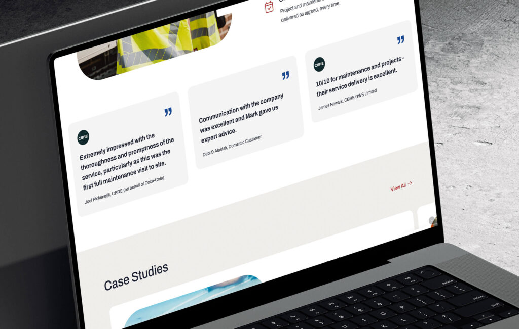
- Social Proof: People are cautious online and rarely rely on a business’s word alone. Reviews, testimonials, client logos, and real project examples act as shortcuts for decision-making. Seeing that others have had a positive experience reduces perceived risk.
- Aesthetic-Usability Effect: A clean, well-structured design does more than improve appearance. People often interpret it as a sign of competence and professionalism. Poor layout, clutter, or inconsistency can increase perceived risk, even if the underlying service is strong.
How to Build E-E-A-T Into Your Website
Building E-E-A-T into a website rarely means starting from scratch. It’s usually about reducing friction and making key information easier to find. Place important signals where people naturally expect them. This aligns with familiar website patterns (Mental Models) and clear presentation (Framing), both of which support trust and decision-making.
Homepage: The First Impression
The homepage is often the first chance to answer: “What do you do, and can I rely on you?” Use structure and clarity to reduce doubt early.
- Visual Hierarchy: Arrange content so attention moves naturally to the most important elements, such as core services or the next step. Size, contrast, and placement guide the eye.
- Law of Proximity: Keep related items together. For example, place a testimonial beside the service it refers to. Logical grouping reduces mental effort.
- Banner Blindness: Avoid elements that resemble adverts, such as overly promotional graphics or intrusive pop-ups. Clear headings and human imagery tend to hold attention more effectively.
- Mental Models: Follow familiar layout patterns. Standard navigation, predictable page structures, and clearly labelled sections help users feel oriented.
- Framing: Present information in terms of outcomes. For example, “What this helps you achieve” is usually clearer than a list of service features.
Service Pages: Demonstrating Expertise
Service pages are where visitors look for evidence that the provider can deliver. This is the place to explain the process and remove uncertainty.
- Outline how the work happens in practical terms
- Answer common questions through FAQs
- Show relevant past work or examples
- Use clear framing so benefits are easy to understand
- Reduce perceived risk with clarity, transparency, and reassurance
Core Trust Signals to Include
Some signals consistently support credibility across key pages:
- Reviews and testimonials
- Accreditations or memberships
- Examples of real projects
- Clear information about the people behind the business
- Content that demonstrates authority in the field
Placing these thoughtfully helps visitors form confidence before deciding what to do next.
Go Deeper
Conversion-Focused Web Design: A Framework for Turning Traffic into Enquiries
Blogging and Content That Builds Trust
Content is a practical way to show real Experience and Expertise. Instead of writing only for search engines, focus on the concerns customers may not always voice directly.
- Address the Fear, Not Just the Question: Useful content often tackles risks, common mistakes, or overlooked challenges in the industry. This signals real familiarity with the work, not just surface knowledge.
- Curiosity Gap (Use Carefully): Slight intrigue in a headline can attract attention, but clarity matters more than cleverness. Overly vague titles can feel manipulative and reduce trust.
- Helpfulness Over Length: Depth is shown through usefulness, not word count. A short article that solves one clear problem can be more credible than a long piece that repeats itself. Reducing mental effort improves the reader’s experience.
Clear Authorship Signals
Expertise and authority are easier to trust when content is linked to real people.
- Show the Author: Include a visible author name and role on each article. A small photo can help readers connect the information to a person.
- Link to a Detailed Bio: The author’s name should lead to a page outlining background, experience, and relevant qualifications. This provides context before the reader evaluates the advice.
- “Reviewed By” Notes: For higher-risk topics, a simple note that content has been reviewed by another qualified person can strengthen credibility.
Using Honest Framing to Build Trust
Discussing limitations can increase credibility.
- Answer “When It May Not Be the Right Fit”: Content that explains situations where a product or service may not suit someone shows transparency and helps readers judge for themselves.
- Acknowledge Constraints: If a service involves cost, complexity, or commitment, stating that clearly helps people assess fit without pressure.
- Fair Comparisons: When discussing alternatives, recognising where another option may be stronger often increases perceived honesty.
How E-E-A-T Supports SEO and Conversions
E-E-A-T isn’t about choosing between users and search engines. The signals that help people feel confident on a website are often the same signals that search engines associate with quality and relevance. As trust increases, engagement tends to improve, which can support search visibility over time.
Anchoring the First Impression
Anchoring describes how people rely heavily on the first information they encounter when forming a judgement. On a website, the visual design and hero section often set that initial impression.
- Conversion: When the opening section clearly explains what the business does and presents information in a structured, professional way, visitors are more likely to interpret the rest of the page positively.
- SEO: A clear first impression can reduce confusion and encourage visitors to continue exploring, which supports engagement signals search engines monitor.
Reducing Risk (Loss Aversion)
Every enquiry or purchase involves some level of perceived risk. Loss Aversion explains why the possibility of a negative outcome can feel more significant than the potential benefit.
- Conversion: Clear policies, visible contact details, security information, and consistent social proof can help reduce uncertainty. When people feel safer, taking the next step feels more manageable.
- SEO: When visitors feel comfortable, they tend to spend more time engaging with content and navigating the site, which supports overall quality signals.
Finishing Strong: The Peak-End Rule
The Peak–End Rule suggests people remember experiences based largely on how they felt at the most intense moment and at the end.
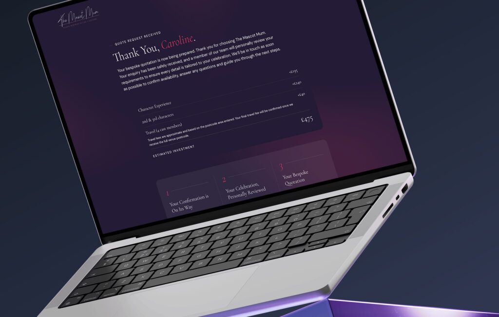
- Conversion: The final stage of a journey, such as a confirmation page after a form submission, can shape how the entire interaction is remembered. Clear confirmation, next steps, and a calm tone help end the experience positively.
- SEO: Positive experiences encourage return visits and further exploration, which can strengthen long-term engagement.
What This Means for SME Owners
Many SMEs are told they need more traffic, a redesign, or lower prices. Often, the issue is simpler: the website doesn’t provide enough reassurance for people to feel comfortable making contact. This is where strategic web design services can make a difference, by focusing on clarity, structure, and the signals that reduce uncertainty.
Google’s quality guidelines place strong emphasis on trust, and so do real customers. A visually polished site without clear proof, such as testimonials, accreditations, or examples of work, can underperform compared to a simpler site that reduces uncertainty at each step.
This changes where effort is best spent. Effective web design is not only about appearance; it’s about understanding how people make decisions. Knowing where visitors look for reassurance, and how to present information clearly, can have a noticeable impact on enquiries.
Over time, credibility signals build value. Content, authorship, examples of work, and visible expertise don’t disappear when a campaign ends. They continue to support search visibility and user confidence, contributing to steadier performance.
FAQs: Building a Website That Converts with E-E-A-T
Why isn’t my website converting even though it looks professional?
Do I need a completely new website to improve trust?
How do I show Experience and Expertise online?
Are testimonials and reviews really that important?
How does E-E-A-T help my SEO?
Should I highlight the limitations of my services?
What’s the fastest way to implement E-E-A-T on my site?
Will improving E-E-A-T replace my paid advertising?
Build a Website That People Instantly Trust
You’ve seen how E-E-A-T connects trust, usability, and performance. In many cases, improvement comes from clearer structure, visible credibility signals, and reducing uncertainty at key moments.
Most changes can be made gradually. Even small adjustments to messaging, layout, and proof can have a noticeable effect over time.
Not sure where trust might be breaking down?
A short review can highlight areas where visitors may be hesitating and where clearer structure or proof could help.