Quick Overview
- Users prefer websites that follow familiar patterns
- Familiar structure reduces mental effort
- Reduced effort supports confidence and action
- Reinventing navigation or layout can introduce subtle friction
- Conventions should only be changed if it makes the site easier to use
Websites Don’t Need to Be Reinvented
It’s natural to want a website that feels different. Businesses want to stand out, look modern, and avoid appearing like everyone else.
But people visiting your website aren’t looking for originality. In most cases, they expect things to feel familiar.
When navigation moves, layouts change, or common patterns are redesigned to feel unique, the site becomes harder to use. The menu isn’t where people expect it. The contact link sits in an unusual place. Sections don’t follow the structure people are used to.The site still works, but the experience requires more effort than it should. This is where Jakob’s Law applies.
What Is Jakob’s Law?
Jakob’s Law states that users spend most of their time on other websites. Because of this, they prefer your website to work in a similar way to the ones they already know.
Over time, people build expectations about how websites behave:
- The logo returns to the homepage
- Navigation appears where they expect it
- Contact details are easy to find
- Forms follow a familiar structure
These patterns aren’t learned consciously. They develop through repeated use of thousands of similar interfaces. When a website follows them, visitors move through it quickly without thinking about how it works. When those patterns are broken, mental effort increases, and in web design, reducing unnecessary effort is one of the simplest ways to improve usability, and make enquiries and sales more likely.
Why Familiar Layouts Convert Better
When someone lands on a website, they’re usually trying to achieve something specific: find information, compare options, make contact, or buy. They aren’t there to learn how the interface works.
Familiar patterns reduce friction, preserve momentum, and make action more likely. When a layout feels unfamiliar, small pauses appear:
- Visitors search for navigation
- They scan longer than expected
- They double-check where a link might lead
Individually these pauses seem minor, but together they erode confidence and make visitors less likely to click or take the next step.
Examples of Jakob’s Law in Website Design
Familiar patterns aren’t accidental. They’re repeated because they work. Here are the most common areas where Jakob’s Law has the biggest impact on usability and conversion.
Navigation Placement
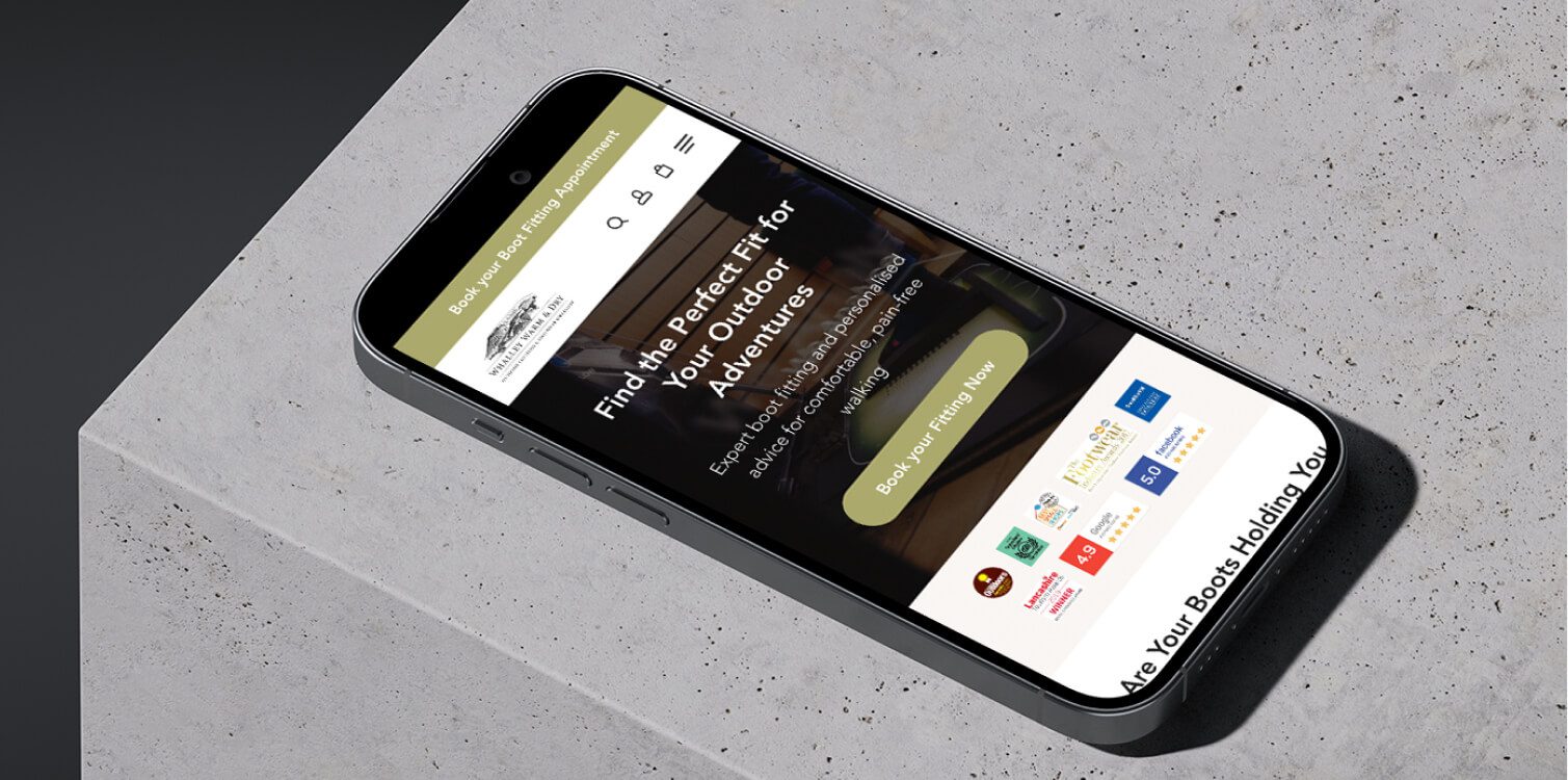
Most websites place their primary navigation across the top of the page. The logo usually sits on the left and links back to the homepage, while contact details or calls to action often appear on the right.
When this structure is followed, visitors move instinctively. When navigation is hidden or relocated without a clear reason, users pause and pauses cost you conversions.
Ecommerce Layouts
Online shops tend to follow consistent patterns:
- Price appears near the product title
- Reviews sit close to the product summary
- Filters appear to the left or above listings
- The basket icon sits in the top corner
These conventions reduce uncertainty because shoppers know where to look.
When product information is scattered or key elements are moved, comparing products becomes harder, hesitation increases, and shoppers are less likely to complete the purchase.
Forms and Calls to Action
Contact forms typically follow a simple structure:
- Labels sit above or inside each field
- Required fields are clearly marked
- The submit button sits at the bottom
- Confirmation messages appear after submission
Primary calls to action are placed in predictable positions because visitors scan in familiar patterns. When forms are unconventional or buttons are styled in a way that hides their function, people become uncertain about what to do next.
When Breaking Conventions Makes Sense
Jakob’s Law doesn’t mean every website must look identical. Conventions exist because they reduce effort, but there are situations where changing them is intentional and useful:
- Campaign landing pages sometimes remove navigation to keep attention on a single action
- Checkout flows often simplify layout to reduce distraction
- Luxury brands may use minimal navigation to control pacing
- Creative portfolios may experiment with structure to reflect personality
The difference is intent. When a convention is changed, it should improve clarity, guide attention, or support the goal of the page, not exist purely to look different.
The test is simple: does this change make the experience clearer or harder? If a visitor has to think more about the interface than their actual goal, the change is working against you.
Go Deeper
Conversion-Focused Web Design: A Framework for Turning Traffic into Enquiries
How to Apply Jakob’s Law in Practice
You don’t need to redesign everything to apply this principle. Small structural decisions often have the biggest impact.
Start with navigation
- Is your primary menu where people expect it to be?
- Is the contact link easy to find?
- Does the logo link back to the homepage?
Review your page hierarchy
- Are headings structured logically?
- Do sections follow a predictable flow?
- Does each page guide the visitor towards a clear next step?
Examine calls to action
- Do buttons look clickable?
- Are they placed where users naturally expect to see them?
Check interaction patterns
- Are forms straightforward?
- Are error messages clear and helpful?
- Are animations subtle rather than distracting?
Consider technical choices
Custom navigation systems, unconventional scroll behaviour, or complex interactive elements introduced during web development should always be judged against usability. If they increase effort without increasing clarity, they are working against you.
A simple audit question helps
If someone unfamiliar with your business lands on the page, can they predict where to click next without thinking about it? If yes, the design is working with familiarity, not against it.
Build a Website That Feels Instantly Clear
Visitors shouldn’t have to work out how your website works. They should be able to focus on what you offer and whether it fits their needs.
If your current site feels harder to use than it should, structure is usually the first place to review.