
Quick Overview
- Visitors rarely remember a page evenly. The first and last items tend to stick, while the middle quietly fades.
- Visual prominence won’t fix a position problem.
- The principle applies to lists and menus, and to the page as a whole.
- Getting this wrong means your strongest content is sitting where memory can’t reach it.
What the Serial Position Effect Is
Think about the last time you sat through a round of introductions. A week later you’d probably struggle to name most people in the room, but the first person you met and the last you spoke to would likely still come to mind. That’s the serial position effect: when people are given a sequence of items, they tend to remember the ones at the start and the ones at the end far better than anything in between.
It’s made up of two separate mechanisms doing two separate jobs. Primacy is the tendency to remember what comes first, often because there’s less competing for attention yet, so it gets processed properly and stored. Recency is the tendency to remember what comes last, because it’s still sitting in working memory when the sequence ends. The middle tends to get neither advantage.
This matters well beyond psychology textbooks because most decisions in web design involve a sequence of some kind: a pricing page, a service list, a navigation menu, even a single page read from top to bottom.
Primacy: The First Item Sets the Frame
The first item in any sequence does more than get remembered. It tends to set the terms for how everything that follows gets judged. This is why anchoring bias and the serial position effect often show up in the same conversation. Anchoring is about the reference point a visitor uses to judge what comes next.
Put your weakest service first in a list and a visitor’s expectations can be calibrated low before they’ve reached the service that would have actually impressed them. Put your cheapest pricing tier first and everything else on the page can read as expensive by comparison, even tiers that are reasonably priced on their own. Put a generic stock phrase at the top of a homepage and a visitor’s first impression of the business is often set by that phrase, not by the strong work three sections down.
Whatever you most need a visitor to register, whatever sets the right tone for the business, usually belongs first.
This is worth taking seriously at the navigation level too. The first item in a main menu isn’t just a link, it’s often the visitor’s first signal of what the site considers most important. A menu that opens with “About” or “Blog” before anything related to the actual service can quietly tell visitors the wrong thing is the priority.
Recency: The Last Thing a Visitor Sees Is What They Take Away
Recency does a different job to primacy. Primacy shapes interpretation while a visitor is still reading. Recency shapes what’s left once they’ve stopped.
That distinction matters because the last thing a visitor sees often isn’t the last thing on the page, it’s the last thing they were doing before they left, which might be browsing a pricing table, scrolling a testimonial section, or sitting on a contact form. Whatever that was tends to be what they’re carrying into the decision about whether to come back or get in touch.
This is closely related to the Peak-End Rule, but the two aren’t interchangeable. The Peak-End Rule is about the overall emotional shape of an experience, the best or worst moment plus how it finished. The serial position effect is narrower. A page can end on a flat, unremarkable note and still benefit from recency simply because it was the last thing seen. Whether that ending is also a good one is the Peak-End Rule’s territory.
This means treating the close of any list or page as a genuine opportunity rather than an afterthought. A pricing table that closes on its most ordinary tier risks wasting recency. A homepage that fades out with a generic line about “getting in touch” after strong opening sections has spent the visitor’s attention well and then handed it back largely unused.
Go Deeper
Conversion-Focused Web Design: A Framework for Turning Traffic into Enquiries
The Middle Is Where Things Go to Be Forgotten
If primacy and recency are advantages, the middle of any sequence tends to get the benefit of neither. On a website that disadvantage is often made worse by something else entirely: most visitors aren’t reading in a careful, linear way to begin with. Scanning patterns play a big part in this, and visitors tend to skim, jump, and skip far more than they read in order. A list item with no positional advantage and no scanning advantage can be genuinely hard to notice.
Pricing tables are a clear example of this. The middle tier of a three-tier table is often fighting two disadvantages at once: it’s neither first nor last, and it’s also where decoy pricing and anchoring tactics often get deployed deliberately. Even without any deliberate decoy strategy, a middle tier tends to start from a weaker memory position before pricing psychology gets involved at all.
The same problem shows up in service lists. If web design is the primary service a business offers but it’s the third item in a list of five, it’s sitting in the part of the sequence visitors are least likely to register, regardless of how good it is. It’s worth treating this as a straightforward audit question: does the order of this list reflect what visitors most need to remember, or does it just reflect the order the business happens to think about its own services?

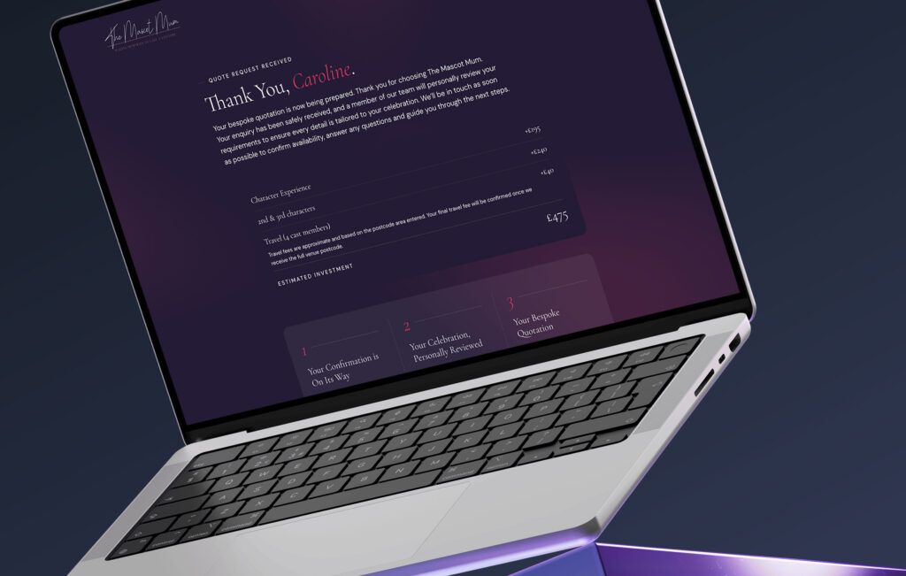
The Mascot Mum, an Accrington-based children’s entertainment company serving Lancashire and Greater Manchester, sequences four packages from £195 to £325, entry-level first to anchor expectations and premium last to close on the strongest option.
What This Means at Page Level
Everything so far has been about components, lists and sequences within a page. The same mechanism tends to apply to the page as a whole, but it’s worth treating separately.
The opening of a page can work like primacy at scale. It sets the frame for how a visitor interprets everything that follows. If the opening section is vague, generic, or slow to get to the point, that’s often the lens a visitor reads the rest of the page through, even if the actual content further down is strong. This is one of the reasons web design and UI/UX decisions at the top of a homepage tend to carry disproportionate weight.
The close of a page works in a similar way to recency at scale. It’s often what a visitor carries with them when they leave. A page that trails off after a strong middle section can hand back a weaker final impression than the content actually earned.
This isn’t about ordering items within a list, it’s about how a single continuous experience gets framed at the start and remembered at the end. A pricing table can be ordered well and a service list can lead and close with the right items, and the page can still undersell itself if the opening doesn’t earn attention or the closing doesn’t leave the right impression.
Ready to put this into practice?
If your pricing, services, or navigation aren’t ordered with intention, visitors are forgetting more of your site than they should. My CRO service looks at exactly this kind of structural detail.
FAQs
Does the serial position effect apply to mobile as well as desktop?
Should I always put my most expensive option first or last in a pricing table?
Does this mean my website should have fewer items in lists and menus?
Is this the same as the Von Restorff Effect?
Related:
- Scanning Patterns in Web Design: Why Visitors Don’t Read Your Website
- Why Users Judge Your Website by Just Two Moments (The Peak-End Rule in Web Design)
- Anchoring Bias and Framing (coming soon)