
Quick Overview
- Why people pause before getting in touch
- What’s really going through a visitor’s mind
- How uncertainty affects decisions on your website
- Key points where visitors hesitate
- Simple changes that make the next step feel easier
Someone lands on your website. They scroll. They read. They hover over the enquiry button. Then they leave.
Most people assume this happens because the offer isn’t compelling enough. Often the real reason is hesitation, not a lack of value.
When a visitor lands on your page, they aren’t just looking for a solution. They’re scanning for reasons to say no. Loss aversion explains why: the pain of a wrong decision is roughly twice as powerful as the pleasure of a right one. When outcomes feel uncertain, the brain defaults to self-protection.
To a visitor, an enquiry isn’t a potential gain. It’s a perceived risk. They aren’t asking “Could this help me?” They’re asking “What could I lose if I click this button?”That loss typically looks like:
- Wasted Time: Will this lead to a 45-minute sales call I don’t need?
- Loss of Control: Once I give them my email, will they ever stop contacting me?
- Reputational Risk: If I recommend this vendor to my team and they underdeliver, I look incompetent.
Why Doing Nothing Feels Safer
Inaction has no immediate downside. No new commitment, no explanation to anyone, no chance of regret if the decision turns out wrong. This instinct shows up everywhere online:
- The Credit Card Barrier
We abandon free trials that require card details. The fear of forgetting to cancel and losing money outweighs the potential benefit of the software. - The Facebook Trap
Many people stay on platforms they no longer enjoy because leaving means losing years of photos, connections, and memories. - The Premium Hook
Many companies let users try premium features for free. Once people experience the benefits, it starts to feel like theirs. Giving it up, even temporarily, triggers a sense of loss. This is the endowment effect in action: we value what we “own,” even if only for a short time.
In each case, the safest option isn’t necessarily the best one. It’s the choice that avoids potential loss.
The same instinct appears when someone hovers over your enquiry button. Doing nothing feels reversible. Clicking feels like commitment.

Loss framing highlights what will be taken away instead of what will be gained. Showing what disappears after cancelling makes users more likely to keep the subscription.
Where Loss Aversion Shows Up on Your Website
Hesitation rarely happens by accident. On most websites, it appears at moments where the next step feels risky.
In conversion-focused web design, we look for five common pressure points.
Vague value propositions (loss of time)
If visitors can’t quickly tell whether your service is relevant, they disengage. Vague headlines force them to figure it out themselves, and the risk of a few wasted minutes feels greater than the unclear benefit of staying.
When the Process Is Undefined (Loss of Control)
People hesitate when they don’t know what happens next. Without clear stages or timelines, the next step feels open-ended, and visitors worry about being locked into something hard to exit.
When Pricing Is a Black Box (Financial Risk)
Without any cost boundaries, the brain assumes the worst. Ambiguity makes financial risk feel bigger than it actually is.
Heavy Forms (Loss of Freedom)
A long form with mandatory phone numbers signals commitment. Hitting submit can feel like surrendering privacy or inviting pressure, and psychologically larger than the action warrants.
Vague Confirmation (Anticipated Regret)
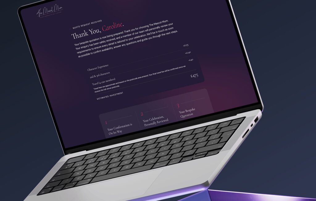
The moment after submission is sensitive. A generic “thanks, we’ll be in touch” can trigger doubt. Because people judge experiences by how they end, this moment shapes how the entire interaction is remembered.
Why Adding More Benefits Doesn’t Fix the Problem
When enquiries are low, the instinct is to strengthen the offer: more bullet points, more results, more differentiation. But if hesitation is driven by loss aversion, extra benefits rarely solve it.
When uncertainty is high, potential gains get discounted. The brain prioritises avoiding downside over pursuing upside. Think of it as a set of scales: one side holds the potential gain of your service; the other holds the fear of making a mistake. Adding more to the gain side doesn’t remove the weight on the fear side. It just makes the decision feel more complex.
Safety has to come before value. Visitors need to feel the potential loss is small before they’ll seriously consider the gain.
Go Deeper
Conversion-Focused Web Design: A Framework for Turning Traffic into Enquiries
How to Reduce Perceived Loss and Increase Website Enquiries
This rarely requires dramatic changes or a full website redesign. It’s about clarity at key decision points.
Clarify the Micro-Step (Reduce Commitment Anxiety)
Instead of a generic contact button, explain what happens next: “Book a 15-minute discovery call, no pitch, just questions.” Specificity makes the action feel smaller and easier to reverse.
Set Pricing Boundaries (Reduce Financial Ambiguity)
You don’t need a full price list, but give realistic ranges. Stating that projects typically start from a given figure stops the imagination inflating the worst case.
Strengthen the Confirmation (Reduce Post-Decision Regret)
Treat it as the beginning of the relationship, not the end of a transaction. Confirm receipt, set a realistic response timeframe, and outline next steps. Clear endings reduce doubt.
Remove Hidden Commitment (Reduce Fear of Irreversibility)
If you offer a lead magnet or trial, be explicit: “No credit card required. No automatic billing. No obligation.” The easier it feels to back out, the smaller the downside feels.

Clear timelines reduce uncertainty. Showing when billing starts and when reminders will be sent lowers perceived risk and makes starting the trial feel safer.
Using Loss Framing Responsibly
Understanding loss aversion can make it tempting to amplify it. Scarcity banners, countdown timers, and abandoned cart emails on ecommerce websites all work because they highlight something that might disappear. But loss aversion cuts both ways.
If a visitor senses fake urgency, the perceived loss shifts. It stops being “I might miss out” and becomes “I might be manipulated.” In service businesses, that loss of trust is far more damaging than a missed enquiry.
Ethical loss framing clarifies real limits rather than manufacturing fear:
- Authentic scarcity: If you genuinely only take on two projects a month, saying so helps the visitor understand the real trade-off of waiting.
- Transparent consequences: “Pricing increases on 1st May” is more useful than “Act now.” Clear deadlines reduce uncertainty; artificial ones increase it.
When limits are honest, they lower ambiguity. When they’re manufactured, they raise perceived risk.
Is Your Website Reducing Perceived Loss, or Amplifying It?
High-performing websites don’t succeed by being louder or more persuasive. They succeed by making the next step feel safe. When visitors hesitate, it’s rarely because they don’t see the value. It’s because the perceived loss of acting feels greater than the gain.
Shift your focus from adding benefits to removing uncertainty. Clarify the process. Set boundaries. Make the next step feel small and reversible. When the downside feels contained, action becomes rational rather than risky.
Reduce Hesitation. Increase Enquiries.
If your website looks professional but enquiries aren’t consistent, the issue is often uncertainty, not value.