
Quick Overview
- Most visitors don’t enquire from businesses they’ve just met. They enquire from ones they already feel something towards
- Reciprocity is a psychological principle that triggers a sense of obligation when someone gives you something first
- It tends to operate at two levels on a website: what you offer before asking, and how the design itself treats the visitor
- Get either level wrong and enquiries suffer, regardless of how good your service is
Give First, Ask Second
Imagine you’re at a networking event. Someone walks over, introduces themselves, and within thirty seconds hands you their card and asks if you’d like to book a call. You take the card. You don’t book the call.
Now imagine a different version. Same event, same person. But this time they spend ten minutes asking about your business, share something genuinely useful about a problem you mentioned, and only then mention what they do. You leave thinking about them differently. The follow-up email doesn’t feel like a cold pitch.
The difference between those two interactions isn’t the quality of the service on offer. It’s the order of events. One person asked before they’d given anything. The other gave first. For a visitor who arrives cold: no referral, no prior knowledge, no reason yet to trust you, a website that opens straight onto a contact form or a quote request makes the same mistake as the first person at the networking event. They haven’t been given anything yet, so they have no reason to respond.
The order of events matters more than most businesses realise.
The Psychology Behind It
Reciprocity is one of the most well-documented principles in social psychology. When someone gives us something, a gift, a favour, useful information, we feel a pull to give something back. It’s not a conscious decision. It happens before we’ve had time to evaluate whether the original gesture was even worth receiving.
Robert Cialdini documented this extensively in his research on influence. In one study, waiters who left a small mint with the bill received significantly higher tips than those who didn’t. Not because the mint had any real value, but because the gesture triggered a sense of obligation.
On a website, when a visitor feels you’ve given them something before asking for anything in return, they reach your enquiry form in a different state. The barrier is lower. The trust is higher. The reluctance that would otherwise stop them from filling it in is already smaller.
The key word is before. Reciprocity only works in the right order. Give first, ask second.

This UX platform gives free access to case studies before asking you to commit to a course. It's a format that works - the value of the free content is often what tips the decision to buy
What You Offer Before the Ask
Macro reciprocity is about what you offer at the content and proposition level. The things a visitor can take away before they’ve handed over a single detail.
Useful content
The most obvious example is genuinely useful content. Blog posts that answer real questions, guides that explain something clearly, resources that help someone understand their problem better. These create a sense that you’ve already done something for the visitor. By the time they reach your services page or contact form, they’re not meeting you for the first time. They’ve already received something from you.
This is one of the reasons content marketing works beyond SEO. A visitor who has read several of your articles before reaching your contact page is in a completely different frame of mind to someone who landed directly on your homepage. They already have a sense of how you think. More importantly, they feel like you’ve already helped them.
Free tools and resources
Calculators, checklists, self-assessments. Anything a visitor can use and take value from without committing to a conversation. These work especially well for service businesses because they let the visitor experience something of what it’s like to work with you, before the stakes of actually working with you kick in.
HubSpot’s resource library is a good example of this done at scale: over 900 free guides, templates and tools, all accessible before the visitor has any reason to consider a paid product.

HubSpot's resource library offers over 900 free guides, templates and tools. Every card says "Access for Free." The ask comes much later
Ecommerce
For ecommerce businesses, the same principle applies differently. Detailed product content, comparison tools, and transparent returns policies all give the visitor something before asking for the sale. They reduce the perceived risk of buying, which is itself a form of generosity. Good ecommerce design doesn’t just make purchasing easier. It makes the visitor feel the business has thought about them.
How you frame your proposition
Even the language of your homepage carries a reciprocity signal. A page that opens with “here’s what we do and how much it costs” is transactional. One that opens with “here’s what we know about your problem and why it’s harder to fix than you’d expect” is generous. The second version signals that you understand the visitor’s situation before asking them to do anything.
Reciprocity in practice: Brysk
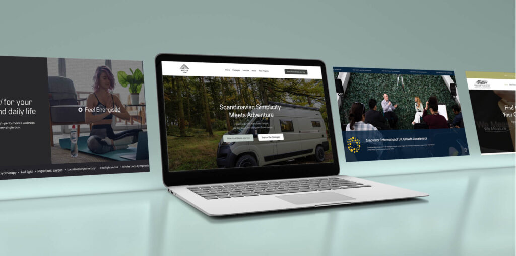
A good example of this working well: Brysk, a Manchester-based recovery and wellbeing centre, opens their homepage not with a list of services but with a single question. “What’s your main goal?” Visitors choose from Recovery, Performance, or Longevity, and the site then shows how the brand’s offering maps to that specific outcome. The site gives the visitor a sense of being understood before it asks anything of them. In the first week after launch, enquiries increased by 10%.
The Signals Your Design Sends
If macro reciprocity is what you offer, micro reciprocity is how the design behaves. And it matters because visitors respond to the feeling of being treated well, even when they can’t point to why.
A fast-loading site is a form of reciprocity. You’ve invested in not wasting the visitor’s time. A clear navigation is reciprocity. You’ve made it easy for them to find what they need rather than what you want them to see. A contact form that only asks for what’s genuinely necessary is reciprocity. You’re not extracting information; you’re making the exchange feel fair.

TinyPNG compresses your images for free, instantly, with no account needed. A small gesture - but that frictionless generosity is exactly what micro reciprocity feels like in practice
These might sound like basic usability considerations, and they are. But they work partly because of reciprocity. When a site treats you well, you respond differently to it. There’s a sense, even if it’s barely conscious, that the business behind it has thought about you. It’s closely related to why visual design affects conversion rates. A site that looks considered signals that the business is considered. The two reinforce each other.
The reverse is equally true. A cluttered layout, slow load times, aggressive pop-ups, a form that asks for your phone number before you’ve decided you want to be called. These all signal that the site is built around what the business wants, not what the visitor needs. That signal creates friction not just in the practical sense, but in the psychological one.
Micro reciprocity costs relatively little to get right. It doesn’t require a content strategy or a free resource. It requires attention to how the site treats people at every small moment. A tool like TinyPNG is a useful reference point here. It does one thing, it does it immediately, and it asks for nothing in return.
Getting that right is something a thoroughly planned web design project should address from the outset, not patch in afterwards.
Not Every Site Has This Problem
It’s worth being clear about what this actually means in practice. A business with strong word-of-mouth, an established reputation, or visitors who arrive already sold on the idea can put a form anywhere and it will convert. The reciprocity has already happened before the visitor landed. The issue is the early ask without the earned trust: asking something of someone who has no context, no reason to feel anything, and nothing yet to go on.
The other thing worth checking is whether what you’re offering actually gives anything away. Content that helps someone think differently about their problem earns goodwill. Content that exists to showcase without teaching tends to register as another ask, even when it isn’t intended that way. Visitors feel that distinction without being able to name it.
This is where conversion rate optimisation tends to find its most straightforward wins. Not in the mechanics of the form or the colour of the button, but in whether the visitor feels the site has already done something for them before it asks anything back.
Go Deeper
Conversion-Focused Web Design: A Framework for Turning Traffic into Enquiries
How to Apply This to Your Own Website
Start by asking an honest question about who your visitors actually are when they arrive. A referred client, someone who has read three of your articles, or a repeat visitor is in a completely different state to someone who found you through a search and landed cold. The sequence matters most for the latter. What does that visitor receive before they’re asked to do anything? If the honest answer is “not much,” that’s the gap to close.
For content, focus on one or two pieces that address the real questions your potential clients ask before they decide to enquire. Not “why choose us” content. That’s still asking. Think about what someone Googles the week before they start looking for a supplier: “how do I know if this problem is worth fixing,” “what should I expect from this kind of service,” “is this something I can sort myself.” Useful, specific, and answering something they actually wanted to know. The broader principles behind this are worth understanding. There’s more on the framework in Conversion-Focused Web Design.
For design, look at the small moments. How fast does the site load? How much does the contact form ask for before the visitor has committed to anything? Are pop-ups appearing before the visitor has had a chance to read anything? Each of these is a signal about whose interests the site serves.
Finally, consider what a visitor takes away from the experience regardless of whether they enquire. If the answer is nothing, no insight, no resource, no clearer sense of their situation, then the site is purely extractive. Reciprocity isn’t a tactic you add at the end. It’s the foundation the ask is built on.
Is Your Website Giving Before It Asks?
Most websites ask for the enquiry before they’ve done anything to earn it. If yours might be one of them, it’s worth a conversation.