
Quick Overview
- Visitors who are genuinely interested still close the tab without enquiring
- Hyperbolic discounting explains why future rewards feel less compelling than they are
- Outcome-led copy and smart sequencing can close the gap
- This isn’t about pressure tactics. It’s about making the reward feel real and near.
The psychology behind putting things off
You’ve done it. So have I. You tell yourself you’ll book the dentist this week, call back that contact next week, sort out the pension later this year. The intention is genuine. It just never quite happens.
This isn’t unique to those things. It’s a predictable feature of how the brain weighs up time. Psychologists call it hyperbolic discounting: the further away a reward feels, the less value we assign to it, even when logically it’s worth pursuing.
The reward of going to the dentist is real. It’s just abstract and future-tense. The small friction of making the call is immediate. So we don’t make it.
Visitors on your website are often caught in the same loop. The benefit of getting in touch is genuine, but it sits somewhere in the future. The effort of filling in a form, or the vague discomfort of a sales conversation, is right now. So they close the tab, tell themselves they’ll come back to it, and often don’t.
The good news: this isn’t about pushing harder. It’s about making the reward feel closer.
What hyperbolic discounting means
The name sounds more complicated than the idea. Given a choice between a reward now and the same reward later, people consistently choose now, even if waiting would get them more. Ask someone if they’d rather have £50 today or £60 in a month, and most will take the £50. The rational choice is to wait. The human choice rarely is.
What makes it hyperbolic is the curve. The drop in perceived value isn’t gradual. It’s steep at first, then flattens out. The difference between “now” and “tomorrow” feels large. The difference between “in three months” and “in four months” barely registers. Proximity is everything.
Applied to your website: a visitor who can clearly picture the outcome of working with you, and who feels that outcome is within reach, is far more likely to enquire than one who sees it as a vague future possibility.

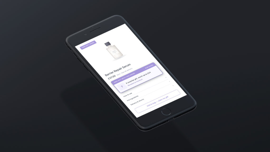
PayPal's payment options are a direct application of hyperbolic discounting: spreading the cost makes the reward feel immediate and the commitment feel smaller
How process-led copy can push visitors away
Most service websites, unintentionally, frame things in a way that pushes the reward further away. It comes up regularly in web design projects I work on.
The language tends to be process-focused in the wrong places. A dedicated process section has its place; it builds confidence and sets expectations. But when it dominates your hero or your CTA, it works against you. “We’ll discuss your requirements, put together a proposal, and develop a solution built around your needs.” That’s accurate. As an opening statement, it’s also a description of effort and time, exactly the kind of framing that makes a future reward feel less immediate.
Compare it to: “Most clients see a noticeable difference within the first few weeks.” The copy is identical in substance. But how you frame the same information changes everything.
Framing isn’t the only thing working against you. The hesitation that loss aversion creates, where visitors focus on what they might risk rather than what they stand to gain, often makes it worse.
Where it shows up in the enquiry journey
Does your hero section lead with the outcome or the process?
If your opening statement describes what you do rather than what changes for the client, you’re starting at a disadvantage. “We offer professional services for businesses of all sizes” positions you. “More customers finding you online, without starting from scratch” puts the outcome front and centre, placing it in the reader’s near future rather than at the end of a project.
What does your CTA actually offer?
“Get in touch” asks the visitor to begin something open-ended. “Find out what’s holding your website back” offers something immediate, a piece of value they can access now. The enquiry is still the mechanism; it just doesn’t feel like the point.
Where does your social proof sit?
A testimonial buried at the bottom of a page lands too late. Placed near the point of hesitation, next to a form or just above the CTA, it closes the psychological distance between “I’m thinking about this” and “this is already working for people like me.”
The order in which you present information can shape whether the reward or the effort lands first.
How to make the reward feel closer
None of this requires a heavy redesign. The changes that address hyperbolic discounting are mostly in copy and sequencing.
Lead with the outcome
Whatever you lead with, headline, subheading, opening sentence, make it about what the client gains, not what you offer. The reward feels closer when it’s the first thing visitors encounter.
Use concrete time references
Vague future tense (“you’ll see results”) is easy to discount. Specific and near (“within the first month,” “before your next busy season”) anchors the reward in time and makes it feel attainable.
Give something in the enquiry itself
If getting in touch comes with immediate value, a clear answer to a question they already have, a quick assessment of something specific, a straight conversation about whether it’s even worth pursuing, the enquiry stops feeling like the start of a long process. This connects to a broader point about reciprocity: when you give first, the response tends to follow.
Reduce the perceived commitment
Language like “no obligation” and “just an initial conversation” compresses the perceived cost of acting. The lower the cost feels, the less it competes with a future-tense reward.
Let results speak in the present tense
Testimonials written in the past tense describe what happened to someone else. Reframe where you can: “Clients typically find that…” puts the reader in the result rather than at a distance from it.
Go Deeper
Conversion-Focused Web Design: A Framework for Turning Traffic into Enquiries
Why urgency tactics usually backfire
Hyperbolic discounting is sometimes used to justify countdown timers, artificial scarcity, and pressure tactics. The thinking is that manufactured urgency collapses the time gap. It does, briefly. But if the urgency isn’t genuine, most visitors clock it quickly, and the trust damage outweighs any short-term lift.
Scarcity and urgency used honestly are a different matter, and worth understanding on their own terms.
The goal here isn’t to push someone into acting before they’re ready. It’s to make sure your website doesn’t accidentally make the reward feel further away than it is. When visitors feel pushed, reactance kicks in and the enquiry rarely follows.
Ready to close the gap?
If your website is describing what you do rather than what changes for the client, that’s often where enquiries are lost. It’s something I look at as part of a conversion rate optimisation review, and it comes up in most web design projects too.