Quick Overview

  • The same colour reads differently depending on everything around it
  • Contrast matters more than colour choice for CTAs
  • Inconsistent colour use quietly erodes visitor confidence
  • Sector expectations shape whether your palette feels right or wrong

Why Colour Meaning Isn’t Fixed

Blue means trust. Red means urgency. Green means go. This kind of colour advice gets shared constantly, and it’s not entirely wrong, but it doesn’t hold up once you look at how colour actually works in practice.

Colours don’t carry fixed meaning the way words do. The same shade of red that signals energy on a gym website can feel alarming on a healthcare one. The same warm amber that reads as premium on an independent coffee brand can read as cheap on a professional services site. In both cases, it’s the design around the colour (the sector, the layout, the other colours on the page) that shapes what visitors take from it.

What determines how a colour communicates is context: the surrounding palette, the sector, the visitor’s expectations, and what the colour is being asked to do.

How Surrounding Colours Change Perception

A warm gold tone on a dark background with restrained typography reads as considered and premium. The same colour on a cluttered white page with competing accents reads as fussy, or cheap. The background, the layout, and the other colours on the page are doing most of the communicating.

This is why “what colour should my button be?” is often the wrong question. A button’s colour only makes sense in relation to the rest of the palette, and contrast matters before colour does. A CTA that doesn’t stand out from its background fails regardless of its shade.

This is why two websites can use the same colour for their primary button and get completely different results. On one site it draws the eye immediately. On the other it blends into the page and gets missed. The colour gets the credit or the blame, but contrast is usually what’s actually doing the work.

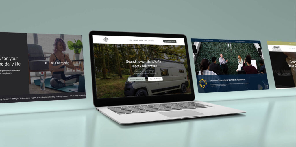
When Bhode Vans came to me for a redesign, stripping back a cluttered layout and establishing clear visual hierarchy came before any colour decisions. Getting contrast right (making it obvious what to look at and in what order) was the foundation everything else was built on.

Sector context shapes this further. Every industry has established colour conventions, and visitors arrive with expectations shaped by every other site they’ve used. Departing from those conventions without good reason creates hesitation before anyone has read a word.

The Variety Funerals project is a good example. Funeral services typically defaults to dark, restrained palettes. The brand stepped away from that deliberately, using colour warmly and approachably. It worked because the rest of the design (the structure, the copy, the pace) held it in place. Without that context, the same colour choices would have felt wrong.

This connects directly to how visual hierarchy and the Von Restorff Effect work: the principle that what differs from its surroundings is what gets noticed.

What Inconsistent Colour Signals

Visitors use colour as a wayfinding system without realising it. The same button colour appearing across every page tells them where to look when they’re ready to act. When that consistency breaks down, they can’t always name what’s wrong. They just feel a low-level uncertainty that makes them less likely to proceed.

A useful framework here is the 60-30-10 rule: roughly 60% neutral (backgrounds and canvas), 30% secondary colour (structure, text, boundaries), and 10% accent, reserved strictly for CTAs and key actions. That 10% is what trains visitors to know where to look. When the accent colour appears on decorative elements or section dividers too, it loses its signal value.

This is what Jakob’s Law describes. Visitors build expectations from every other site they’ve used. When colour behaves predictably, they don’t have to think about it. When it doesn’t, they do.

The TR Stabilisation project is a practical example. The groundworks contractor, based between Accrington and Rossendale, had grown significantly but their site hadn’t kept pace. The mismatch between what the site communicated and what the business had become created doubt for new visitors before a conversation had even started. Bringing visual consistency in line with the professionalism of the operation was a core part of the redesign.

Go Deeper

Conversion-Focused Web Design: A Framework for Turning Traffic into Enquiries

Conversion-Focused Web Design: A Framework for Turning Traffic into Enquiries

The Colour Mistakes Most SME Sites Make

Most colour problems aren’t the result of choosing the wrong shade. They’re the result of treating colour as a series of one-off decisions rather than a system.

Too many accent colours. Every additional colour competes for attention. The more colours in use, the harder visitors have to work to decode what each one means.

No single CTA colour. If the primary call to action appears in different colours across the site, visitors can’t build a reliable expectation of where to look. A button that’s teal on the homepage and dark blue on the contact page is doing half the job it could.

Brand colours that work in print but not on screen. A colour that looks strong on a business card can look flat or harsh on a monitor. If your brand colour was defined for print and never adapted for digital, it may be communicating something you didn’t intend.

Colour used to decorate rather than direct. Gradient overlays, coloured section backgrounds, and decorative dividers are common on SME sites and often serve no functional purpose. When colour doesn’t serve hierarchy or wayfinding, it adds noise without adding clarity.

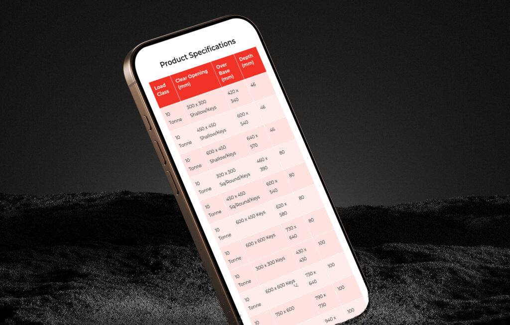
RTC Safety Surfaces illustrates this well. The Burnley-based safety surfacing company operates worldwide, but their previous website created a brand disconnect that didn’t reflect the quality of the business. The redesign brought their online presence into alignment with the actual work.

Not Sure What Your Colour Scheme Is Communicating?

If your palette has grown without a clear system behind it, web design and CRO reviews often start here. Get in touch to talk it through.

Get a Free Consultation

FAQs

Does button colour actually affect conversions?

It can, but rarely in the way the advice suggests. The colour of a button matters far less than whether it stands out clearly from its surroundings, appears consistently across the site, and is visually distinct from every other interactive element. A well-contrasted button in almost any colour will outperform a “conversion-optimised” colour that blends into the page.

Should I follow colour conventions for my industry?

Generally, yes, at least as a starting point. Departing from sector conventions is possible, but it needs to be deliberate and supported by the rest of the design. If everything else about the site signals credibility and expertise, an unconventional palette can reinforce that. If the rest of the site is generic, an unusual colour choice tends to read as a mismatch rather than a bold decision.

How many colours should a website use?

Most effective websites work with a limited palette, and a useful framework is the 60-30-10 rule: roughly 60% dominant neutral (backgrounds and canvas), 30% secondary colour (structural elements, text, boundaries), and 10% accent, reserved strictly for CTAs and key actions. That 10% is what draws the eye where you need it. Adding colours beyond this tends to reduce clarity rather than improve it. If you’re using more than three or four distinct colours, it’s worth asking what each one is doing and whether it’s earning its place.

Why does my brand colour look different on screen than in print?

Print and screen use different colour models, CMYK for print and RGB for screen, and the same hex or Pantone reference can render differently depending on the display, the calibration, and the surrounding colours. If your brand colour was defined primarily for print, it may need to be reviewed and adjusted for digital use.

Can the wrong colours actually cost me enquiries?

They can contribute to it, indirectly. Colour problems rarely drive visitors away on their own, but when combined with other issues (unclear hierarchy, inconsistent CTAs, a design that doesn’t match sector expectations), they add to a cumulative sense that the site isn’t quite right. That feeling tends to show up as hesitation before enquiring, or visitors leaving without being able to say why.

More Insights

Get a bespoke website for your business
Conversion-Focused Web Design: A Framework for Turning Traffic into Enquiries

Conversion-Focused Web Design: A Framework for Turning Traffic into Enquiries

Learn how behavioural psychology principles like decision-making, attention, and cognitive load shape high-performing websites, and how structured design turns visits into real business enquiries.
17 January 202630 min Read More
social proof web design
Social Proof in Web Design: Why a Perfect Rating Can Cost You Sales

Social Proof in Web Design: Why a Perfect Rating Can Cost You Sales

Quick Overview Purchase likelihood typically peaks when a rating sits between 4.0 and 4.7 stars, not at 5.0. A completely flawless record tends to read as manufactured rather than reassuring. Social proof works by lowering the perceived risk of enquiring,…
10 October 20267 min Read More
authority bias web design
How Credibility Signals Shape Brand Trust (Authority Bias and the Halo Effect)

How Credibility Signals Shape Brand Trust (Authority Bias and the Halo Effect)

Quick Overview Credentials (certifications, awards, well-known clients, years in business) build trust. That's authority bias That trust can spread to the rest of the site. That's the halo effect Visitors judge a site's design in about 50 milliseconds, which can…
3 October 20269 min Read More
websites for companies around hyndburn the north west and the uk
Sunk Cost and Investment Loops: Why You Won’t Scrap a Failing Website

Sunk Cost and Investment Loops: Why You Won’t Scrap a Failing Website

Quick Overview Once you've spent money and time on something, it's hard to admit it wasn't worth it, even when the numbers say otherwise. That's called the sunk cost effect, and it's often the real reason a business keeps a…
26 September 20267 min Read More
How to Write a Call to Action That Gets Clicked

How to Write a Call to Action That Gets Clicked

Most CTAs describe the click, not what visitors get. Here's how to write one that earns the click instead of losing it.
12 September 20267 min Read More
E-commerce website built for small business owner
Narrative Bias in Web Design: Why Your Website Is Already Telling a Story

Narrative Bias in Web Design: Why Your Website Is Already Telling a Story

Narrative bias explains why disconnected pages quietly cost trust, and how to fix it.
5 September 202613 min Read More
Why a Quote Form Often Beats a Standard Enquiry Form (Endowment and IKEA Effects)

Why a Quote Form Often Beats a Standard Enquiry Form (Endowment and IKEA Effects)

Why a quote form often beats a standard one: how the endowment effect and IKEA effect turn visitors into people protecting what they've built.
29 August 202611 min Read More
How to Use the Curiosity Gap on Your Website

How to Use the Curiosity Gap on Your Website

Explaining everything on your website can cost you enquiries. Here's how to use the curiosity gap in web design, and where it backfires.
15 August 20269 min Read More
zeigarnik effect web design
The Zeigarnik Effect in Web Design: Why Open Loops Draw Visitors Back

The Zeigarnik Effect in Web Design: Why Open Loops Draw Visitors Back

Most advice on the Zeigarnik effect in web design stops at progress bars. Here's how open loops bring visitors back to finish what they started.
8 August 20267 min Read More
curse of knowledge in web design
Curse of Knowledge: Is Your Website Copy Confusing Customers?

Curse of Knowledge: Is Your Website Copy Confusing Customers?

The words that feel obvious to you can confuse customers fast. Here's why it happens, and how to fix it without dumbing down your copy.
1 August 20266 min Read More
hick's law and miller's in web design
Why Fewer Visible Choices Convert Better (Hick’s Law & Miller’s Law)

Why Fewer Visible Choices Convert Better (Hick’s Law & Miller’s Law)

A cluttered menu or long service list can quietly turn visitors away. Hick's Law and Miller's Law explain why fewer visible choices convert better.
25 July 20269 min Read More

Start Your Project

High-Converting Websites That Grow Your Business